![[home]](lcc.gif)
 Anguilla Library Computer Club
1 2 3 ... 11 12. Enter the
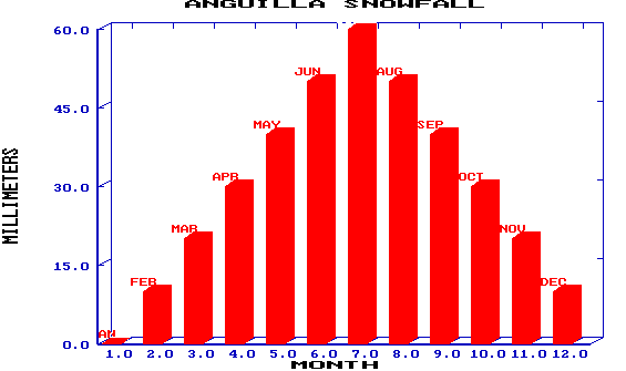
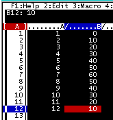
millimeters of snowfall per month in cells B1..B12 as
0 10 20 30 40 50 60 50 40 30 20 10.
To graph snowfall by month, press slash / for the main menu,
G for GRAPH and X for the X-Axis. This is the horizontal line
across the screen, where we will show the months.
Move the cursor to cell A1 and press Period (.) to anchor the range.
Now move the cursor down to A12. You should see A1 to A12 highlighted
and A1..A12 displayed above as your "Independent X-Range".
Press Enter to select this.
Select the column of rainfall values as your Y axis. You can have up to 6 curves on a single graph (A B C D E F) but we only need curve A. Press A for the A curve, then move your cursor to B1, press Period (.), move to B12, and press Enter. Or just type B1..B12 as your "First Y-Range".
You should be back to the Graph menu. Press T for TYPE and B for BAR CHART. Now press V for VIEW and your graph should appear on the screen. Did it? Press ENTER to go back to the Graph Menu and change the TYPE to LINE (press T, L, and V to VIEW). Repeat for AREA chart.
Advanced: You can easily "title" the graph, the X axis and the Y axis. From the Graph Menu, press O for OPTIONS, T for TITLES, and F for FIRST. Type ANGUILLA SNOWFALL and press Enter. Now X for X-AXIS and type MONTH, Enter. Now Y for Y-AXIS and type MILLIMETERS, Enter. Press Q for QUIT twice to get back to the Graph Menu and V to VIEW.
To label the months, enter the names of the months in D1..D12 as
JAN FEB MAR ... DEC. Then use L for LABELS from the Graph Menu
and select D1..D12 as your labels for the A-curve. View your graph
again to see the results.